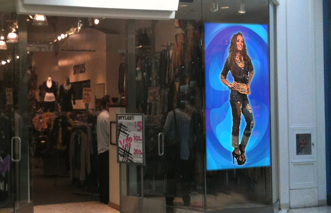
I know this has been addressed before by other of my fellow curmudgeons keeping an eye on the doings in DOOH. Yet the issue remains:
More than one message per screen diminishes the effectiveness of the whole. The infamous "L". A main screen, with a column on the right or left side, accompanied by a lower banner across the entire bottom of the screen, often with a data stream.
Two words: TOO BUSY!
I know this will not stop anyone from using this screen configuration. I know it will not stop the average ad salesperson from trying to sell all those different screen opportunities. But people, please, listen: as a visual layout, this absolutely blows!
The next time you see a digital screen in the marketplace, if it has this layout, I want you to consciously try to notice whether your own eye finds it easy to take in all the messages, images and data that this format presents. I already know the answer.
I totally agree that all of the small screen should be utilized; just not in this manner. This is a content creation issue. This is an issue of actually thinking about your viewer, and caring about whether they will care. Your content better be interesting and relevant. It better grab their attention and deliver the "goods" (message) in a meaningful, useful way, or you risk committing the deadly sin of diminishing (or even completely immasculating) your own medium.
Focus on the want/need/interest/preference of your target viewer. Spend some serious time and money on your content development. You might make a little money this month with a poor ad campaign on behalf of your clients, but not next month. If it does not work, they will not continue to buy. If your network does not produce the desired effect (usually some measurable business-related result) your clients will stop buying and go elsewhere. There are too many opportunities and options available to their ad dollar.
There may (on rare occasions) be legitimate times to utilize a split screen, but I can't think of what they are off-hand. Don't divide your screen (message). Better to shorten your ad units and ad more inventory, than to have multiple disparate messages on one screen at the same time.
Subscribe to:
Post Comments (Atom)


No comments:
Post a Comment